Abduvosit Kadirov
Transforming complex data into actionable insights and building robust data pipelines that drive business decisions.
About Me
Professional Background
I am a passionate Data Analyst and Data Engineer with expertise in transforming raw data into meaningful insights. With a strong foundation in data processing, analysis, and visualization, I help organizations make data-driven decisions that drive growth and efficiency.
My experience spans across various industries including finance, e-commerce, and healthcare, where I've implemented data solutions that have significantly improved business operations and strategic planning.
Interests & Approach
I'm particularly interested in predictive analytics, machine learning applications, and building scalable data pipelines. My approach combines technical expertise with business acumen to deliver solutions that address real-world challenges.
When I'm not working with data, I enjoy contributing to open-source projects, mentoring aspiring data professionals, and staying updated with the latest advancements in data science and engineering.
Technical Skills
Python
Data analysis, scripting, and automation
SQL Server
Database querying, stored procedures, and reporting
Power BI
Dashboards, visual reports, and business insights
Snowflake
Cloud data warehousing, ETL processes, and data modeling
Excel
Advanced data analysis, pivot tables, and financial modeling
Tableau
Data visualization and storytelling
PostgreSQL
Relational analytics with advanced SQL and AWS
Featured Projects
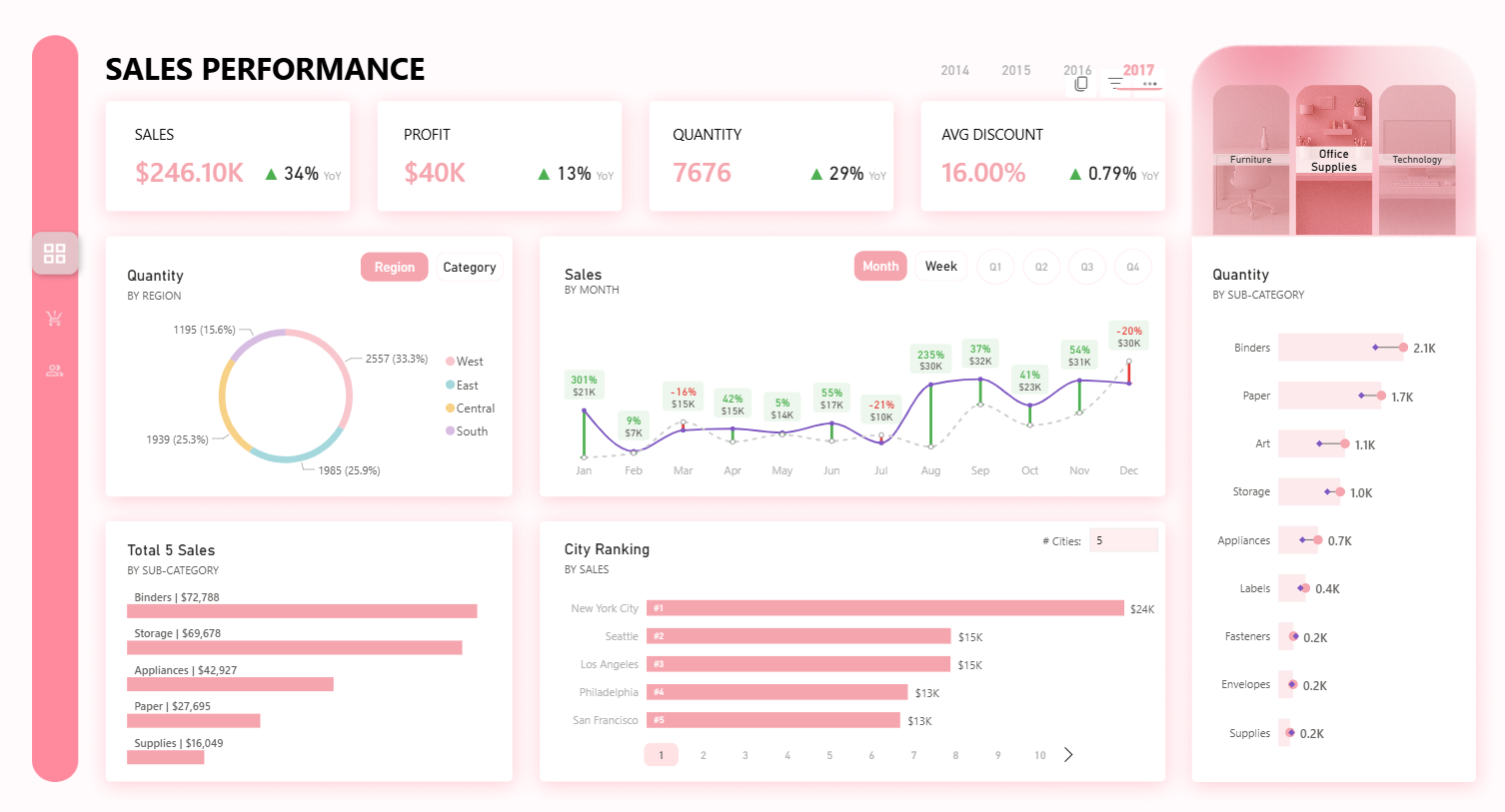
This Sales Performance Dashboard showcases my ability to transform complex sales data into a clear, insightful, and interactive reporting solution using Power BI. Built with a modern layout designed in Figma, the dashboard enables business leaders to monitor dynamic KPIs with YoY indicators, analyze sales trends across months and weeks with auto-quarter logic, and explore detailed city-level and product sub-category performance with intuitive navigation features like pagination and slicers. By leveraging DAX, field parameters, and conditional formatting, I ensured both analytical depth and visual clarity. This project reflects my strong foundation in data modeling, analytical thinking, and dashboard design — all aimed at supporting smarter, faster decision-making in real business environments.
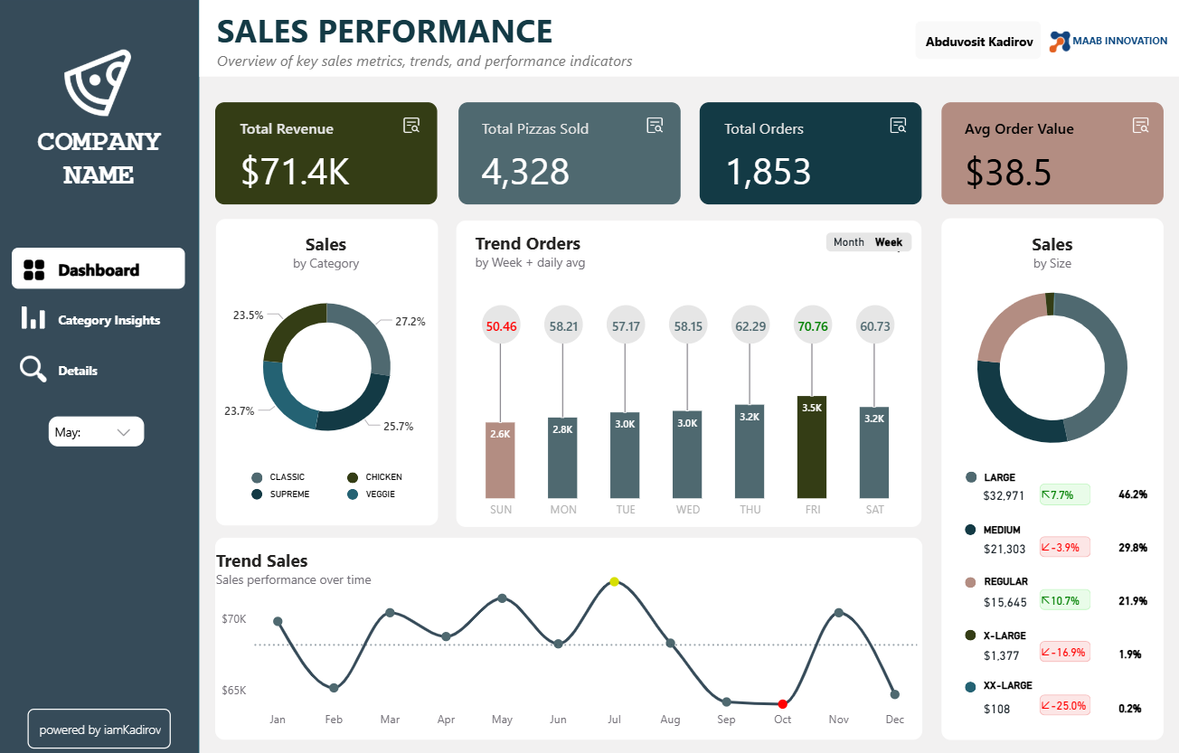
This Power BI dashboard project analyzes pizza sales performance across categories and time periods. It includes KPIs like Total Revenue, Orders, and Pizzas Sold, supported by MoM and YTD growth tracking, dynamic targets, and conditional formatting. A smart drillthrough system enables deep-dive views by category, with SVG-based visuals like donut charts and rounded bar charts. Advanced features include recommendation logic based on performance trends, fully dynamic titles and metrics via field/numeric parameters, and interactive bookmarks for focused KPI analysis. Designed for decision-makers, this report helps uncover sales drivers, identify underperforming areas, and guide marketing and operational strategy.
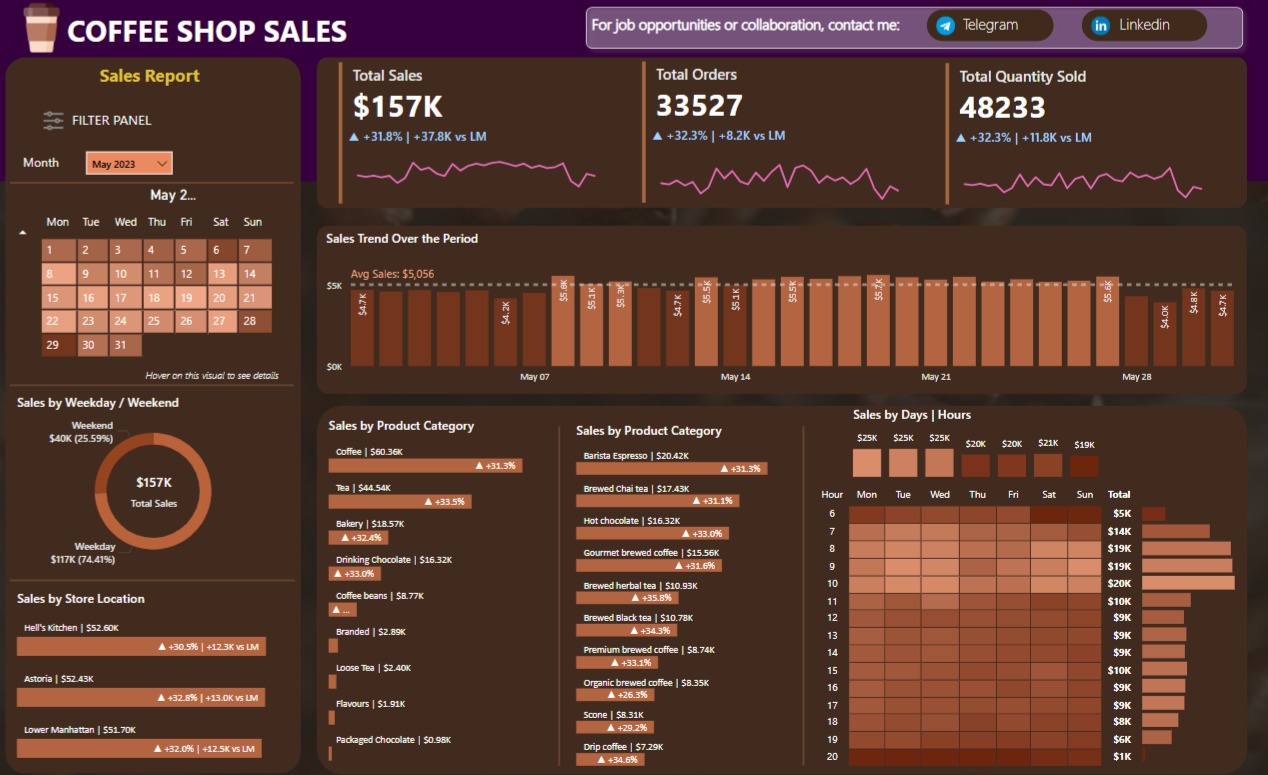
Developed a dynamic Power BI dashboard to analyze coffee shop sales performance. Data was sourced from Excel and SQL, enabling visualization of daily revenue, top-selling products, and customer trends. The project highlights data modeling, DAX usage, and effective report design.
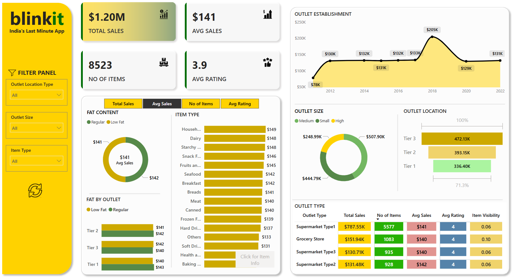
Developed an interactive Power BI dashboard to analyze Blinkit's sales performance. Leveraged SQL and Excel to extract and transform data, providing insights into total sales, average sales, item distribution, and customer ratings. The dashboard enables stakeholders to make informed decisions based on real-time data visualization.
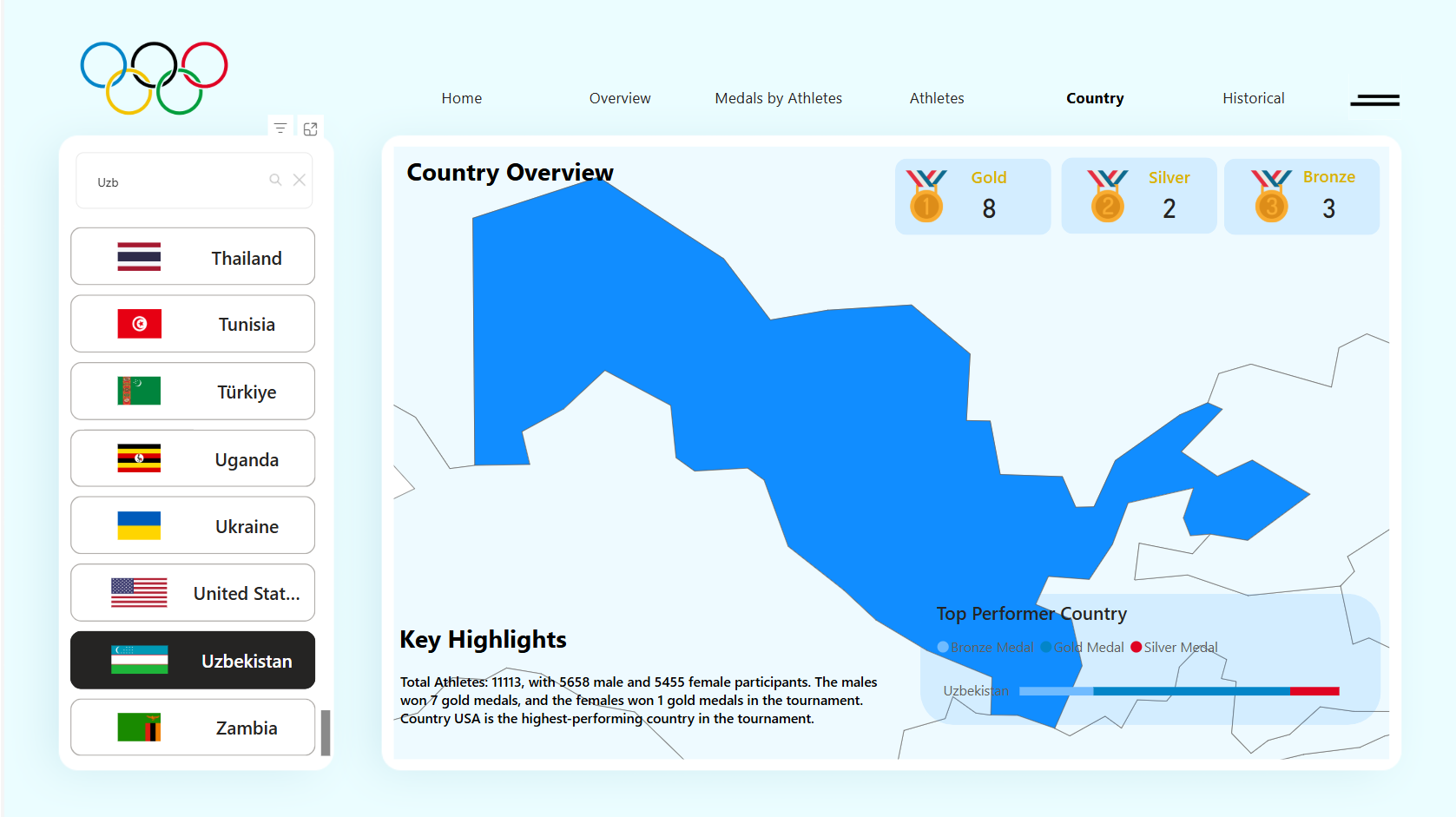
Designed and developed a visually engaging Power BI dashboard to analyze Paris 2024 Olympic data. The project involved extracting and cleaning data using Python from Kaggle, designing the interface in Figma, and building interactive visualizations in Power BI. Key insights include medal tracking, athlete stats, and country-wise performance, with advanced DAX and Power Query techniques applied for dynamic reporting.
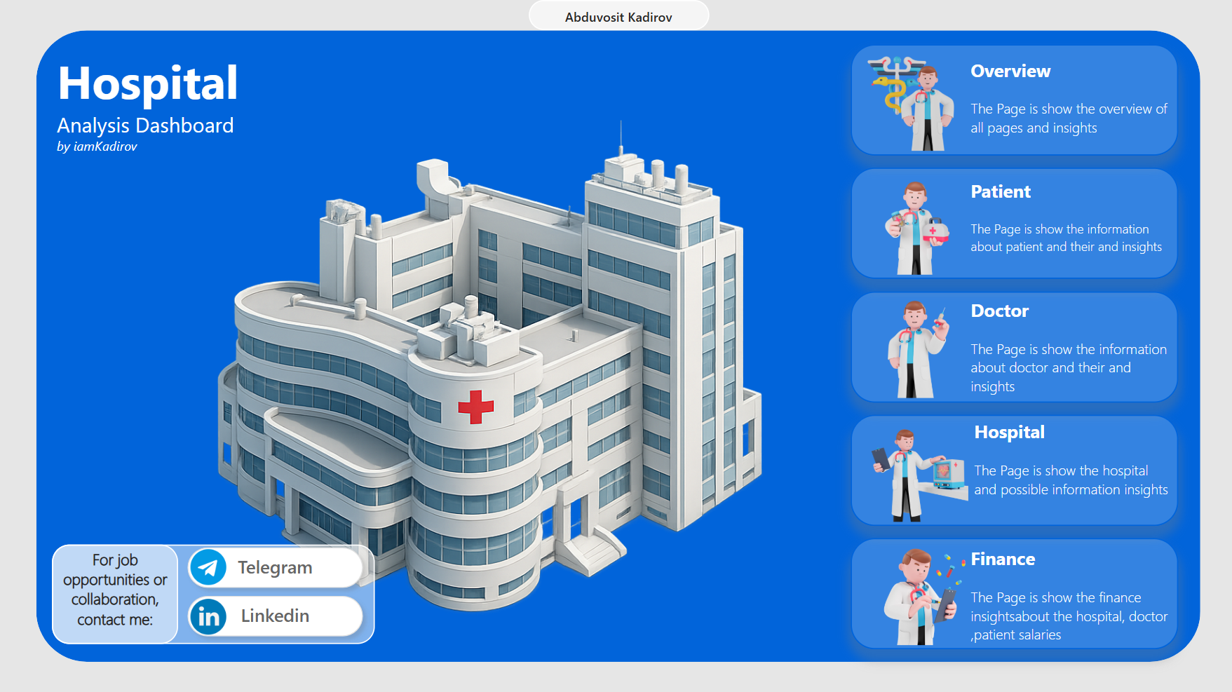
This Power BI dashboard was built to give healthcare managers a clear, interactive view of hospital operations — covering patients, doctors, facilities, and financials. In addition to core metrics, the report also includes insights on surgeries, appointments, and medicine usage, all integrated within the main pages (Overview, Patient, Doctor, Hospital, Finance). The goal is to support faster, data-driven decisions by presenting complex information in a clean, visual format with intuitive navigation, filters, and key KPIs.
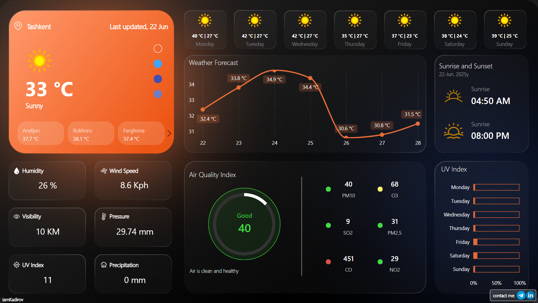
Built a real-time weather and air quality dashboard using Power BI and WeatherAPI. Integrated JSON data, created dynamic DAX measures for AQI interpretation (status, suggestion, color), and designed interactive visuals with city filters and icons. Showcases API integration and advanced data modeling skills.
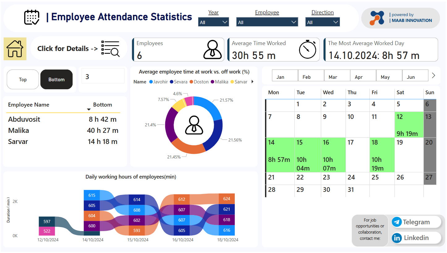
Developed an interactive dashboard to monitor employee attendance and working hours. Key features include Top/Bottom N analysis, calendar heatmap with performance indicators, and employee-level drillthrough insights. Used DAX to calculate deviations, status flags, and dynamic filters. Strengthened practical skills in layout design, data modeling, and drillthrough navigation.
Get In Touch
I'm always open to discussing new projects, opportunities, or partnerships. Feel free to reach out through any of the channels below.
Available for remote work worldwide